Microsoft Pix- a camera app that helps you take pictures using artificial intelligence so you can focus on capturing the moment.
Role- Lead product designer & researcher
At Microsoft Research we spent time understanding the needs of users around photography. The thing we heard a lot was around how people wanter dot capture moments without worrying about the setting. Not everyone is a professional photographer but they would like to still capture with that kind of accuracy in terms of lighting etc. Using the decades of research done by multiple researchers at Microsoft Research we developed a photo application that uses machine learning to tweak your photo settings for you. Additionally it ensure that you don't miss a moment by capture shots before and after the shutter tap. It reduces the effort that you need to put into curating the best photos by automatically choosing the best images based on facial expression, pose, colors, exposure etc. I was tasked with designing the user experience across the app and conducing user research.
The wireframes look at re-thinking the navigation of the application to make it intuitive and usable.
To understand the look the and feel of the app I researched the kinds of photos people take.
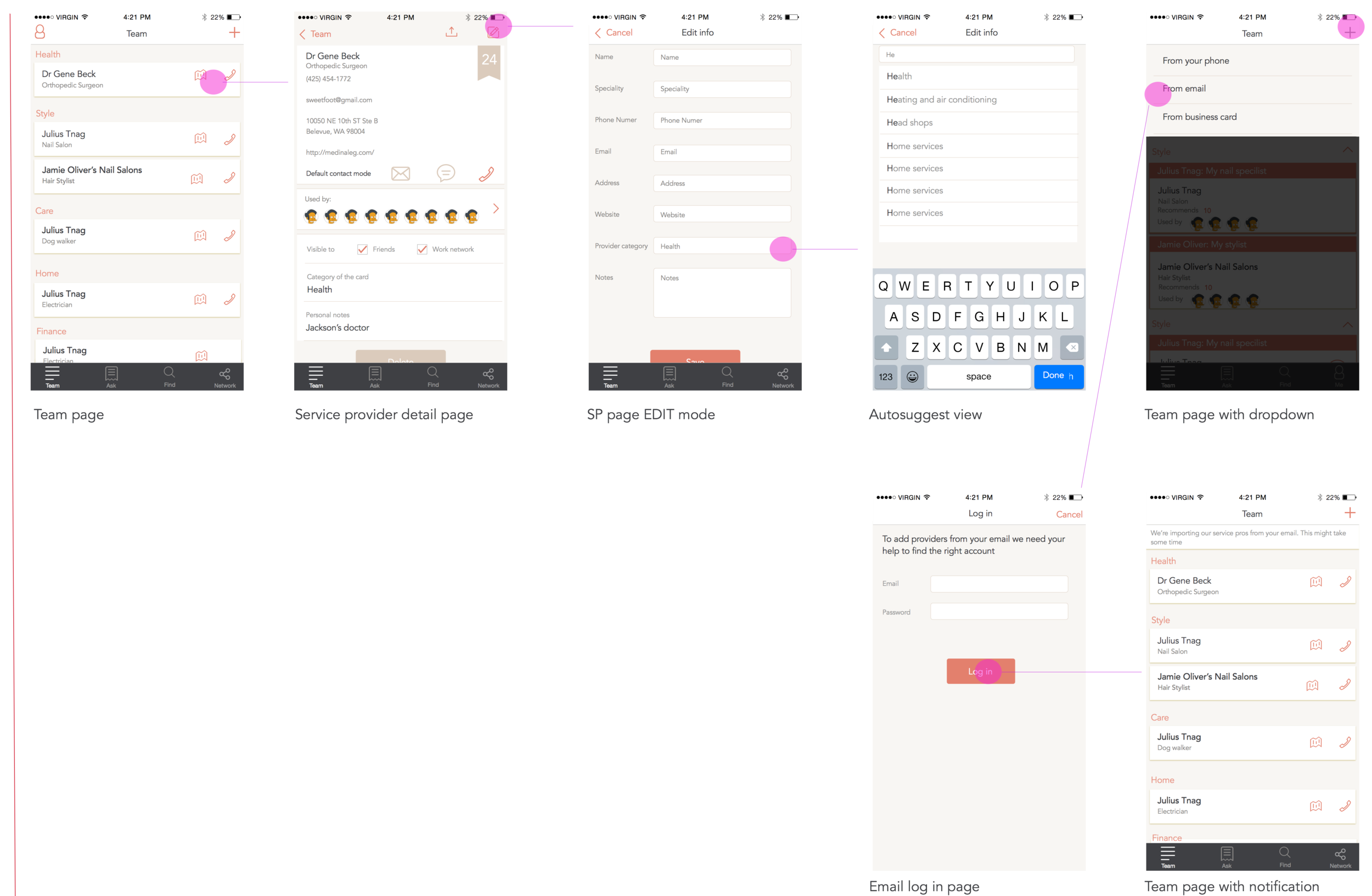
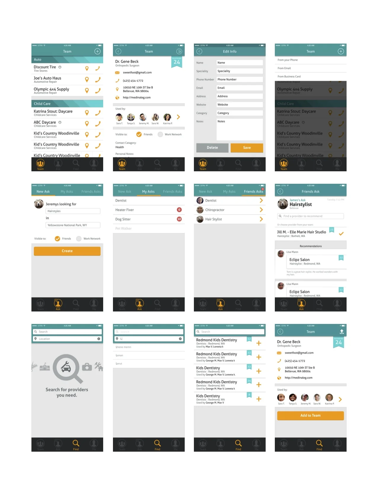
Home team is an application that helps you find service providers you can trust by helping you poll your friends, coworkers and neighbors. We found that people find service providers in different ways that are not satisfied by current offerings in the market.
Released on Windows phone. iOS in progress.
Project Timeline - February - October 2015
Role - Lead designer (web & mobile)
Responsibilities- Interaction design, creative direction for visual design, branding, marketing.
From our research we learnt that people have difficulty managing and finding service providers like doctors, plumbers, pet sitters and lawyers. We also learned that existing services like Yelp don't fully satisfy users in finding someone they can try trust and tend to reach out to their personal connections for recommendations. In a small, agile team we set out to create an application that can support users find trusted service providers. The process was iterative and agile. We tested our assumptions with our users constantly to help improve the experience.
Home team application consisted of a system of features making the application complex. I iterated on the flow to ensure that the interactions making up the system were intuitive and fit into the user's mental modal. We continually tested assumptions with users to refine our concept throughout the process.
We realized that though our biggest value prop is finding people you can rely on through your trusted network, people might not always "ask" their friends. Searching is a behavior that has embedded itself in the way we find information. We changed the way we thought about searching and added additional value by providing information about people in your network who use these pros.
The image show the team, ask and find tab details with the pages skinned with our brand colors and style.
A big part of keeping customers engaged is ensure that they know when there are new features being added, when someone asks for a pro. Part of the design thinking was also designing the transactional and non-transactions emails.
A big part of how we hope to increase engagement is by ensuring the service isn't exclusive. Certain features are accessible by web ensure that friends you "ask" for a pro can recommend someone without having the app installed.
Tiramisu is an iOS and Android app that enhances the public transit system by allowing the transit community to help one another by tracking the bus in real time and providing qualitative information about the condition of buses and stops. Users can let others know when the bus is late and why. It has an emphasis on accessibility.
Download the app for Android
Download the app for iPhone
Advisors - Aaron Steinfeld, John Zimmerman
Robotics Institute, Carnegie Mellon University
Responsibiilities- Interaction design, Visual design, User research
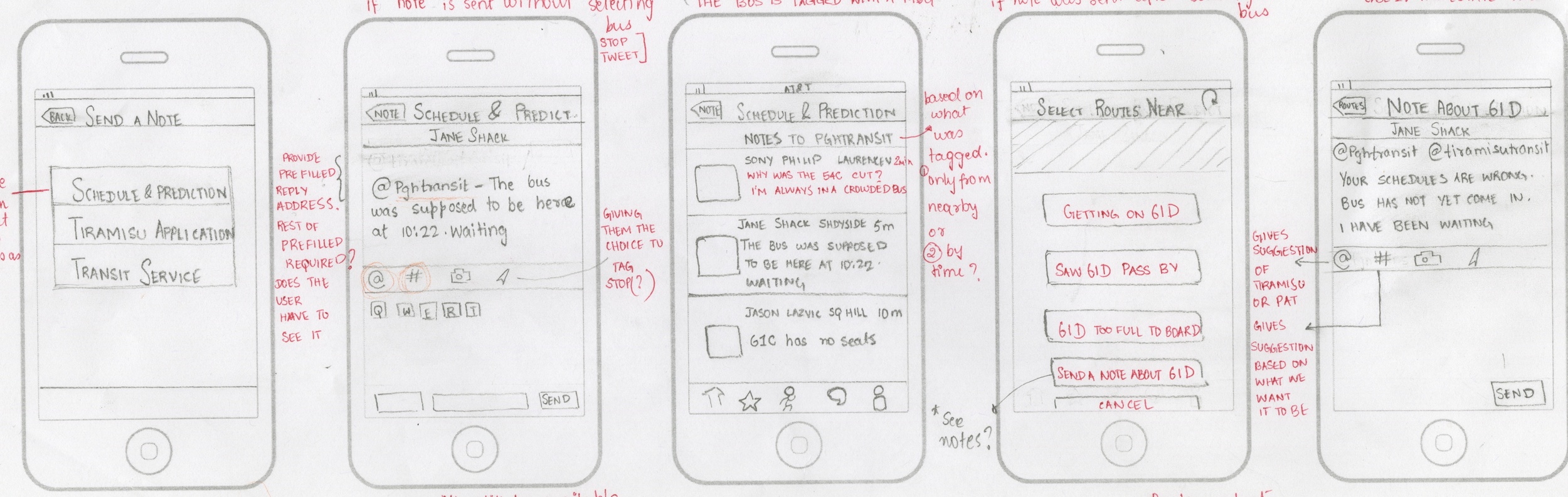
The enhancement to the existing application was an outcome of previous qualitative study and in-depth analysis of the incoming user feedback. We realized that users were using our feedback feature to compliment and complain about Tiramisu and the transit authorities. The interesting trend was that riders were trying to provide additional qualitative information about the ride, the condition of the bus etc as they tracked it. We realized that qualitative information is not always enough and embarked on revamping the design of the application as a whole and enhancing its features
To enable an efficient messaging platform on top of the existing application it was important to understand the intentions of the person creating the message and consumer of the message. I pulled apart the large hairy system, created conceptual models to ensure that I was considering edge cases as well.
The wire framing began. This was probably the longest phase of the design process. My advisors provided feedback based on trends and research they had seen in the past and I iterated on the wireframes in low fidelity to ensure that the user flow, information architecture and interactions were consistent and intuitive.
A system of type, colors and icons were designed and the final iteration of the wireframe flows were skinned. new features like the leader board were conceptualized and designed in addition to supporting multiple level of messaging and enhancements to the UX based on user feedback.
Increased iPhone and Android downloads